IKEA
App Redesign
2023
Junior Designer
Project info
Overview
IKEA is a multinational company that designs and sells ready-to-assemble furniture, kitchen appliances, and home accessories, among other goods and services. Known for its modernist designs and eco-friendly products, IKEA operates a vast network of stores worldwide, offering customers affordable and functional solutions for home living.
Role: Junior Graphic UX Designer
Timeline: 10 weeks
Tools: Figma, Illustrator
Problems
Graphic Design Aspect: Regarding the IKEA mobile app, my problem with the app is that its screens and contents are lengthy and cluttered. The overall visual design of the IKEA mobile app feels overwhelming due to the amount of content presented on each screen. The lack of effective whitespace and the dense arrangement of text and images contributes to a cluttered appearance, making it hard for users to focus on key elements.
UI/UX Aspect: From a user experience perspective, the IKEA mobile app feels unnecessarily complicated due to lengthy screens and an excess of information being crammed into each view. Additionally, the content is not optimally organized, resulting in difficulty locating specific items or information. These factors can led to a potentially overwhelming experience for users.
Goals & Process
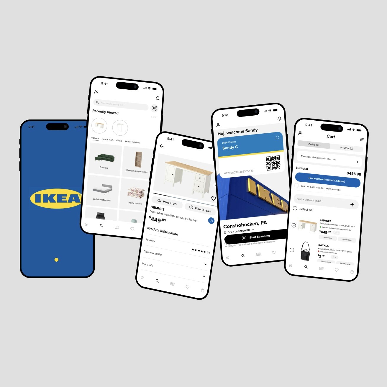
My goal when redesigning was to enhance the visual organization of the app and reduce some of its clutter. My objective was to optimize the content layout to create a more user-friendly environment, ensuring that users can navigate through the app effortlessly. To achieve this, I focused on removing some categories and information that were unnecessary, and instead grouping them into a broader section. The revised layout aims to streamline information, making it easier for users while maintaining a visually appealing and organized presentation. Through some adjustments to the app's visual hierarchy and content structure, I believe the proposed redesign can significantly improve the overall user experience.
Reflections
What I Learned: Being able to spend so much time with Figma, this project and other projects included, made me really comfortable with its features, and in turn, helped me with refining and creating this IKEA redesign. I’m glad that along with creating a process timeline and being able to make our own schedules to hone our independence skills, I was able to have some fun and play more with the animation features of Figma. It was also in this project that I was able to fully understand what components and auto-layouts are meant for and their potential.
Changes?: I would change the way my Lo-Fis and sketches look. I know that since they’re a part of the process and brainstorming stage, they aren’t as important but this change is just a personal thing I think I should do better with. I also think that towards the end I ended up having to fix a lot of small details like the spacing, so I think next time, I’ll set up the spacing first so that I won’t have to do it all over again at the end.
All-in-all, this project has taught me many things like smoothen my design process and making me feel more confident with the advanced features of Figma. Other than this, I also had the chance to explore Figma's animation capabilities, which added an engaging, dynamic element to the project. Overall, this redesign project helped me realize the importance of balancing creativity with structured design processes, ensuring that every detail—whether visual or functional—aligns with user-centered principles.


